From someone who has built, broken, rebuilt, and tested more landing pages than I can count.
Crafting a landing page that consistently converts isn’t about guessing. It’s about experimenting, watching real user behavior, and refining until the page feels frictionless. After years of building every kind of format—from long-form sales pages to quick, minimalist lead capture screens—I’ve seen what works, what falls flat, and what quietly boosts conversions without flashy gimmicks.
Below is a streamlined, affiliate-optimized guide based on real-world testing and thousands of data points.
The Foundation: One Clear Goal
Every landing page needs a singular purpose. The moment you add multiple competing outcomes (“Sign up! Buy now! Read this too!”), the conversion rate drops. A focused page helps visitors understand exactly what’s expected of them, and that clarity builds confidence.
Understanding What Visitors Actually Want
The best-performing pages aren’t designed around what you want to sell—they’re built around what the visitor wants to solve.
After testing dozens of variations, the pages that speak directly to pain points, hopes, and the visitor’s desired transformation always convert higher. For the subjects you’re focussing on, checking forums, reddit and other community based websites that answer real questions really help pinpoint what kind of pain points your target audiences have.
As for your content, readers don’t want features; they want relief, shortcuts, certainty, and ease.
Crafting a Hero Section That Pulls People In
In almost every A/B test, the hero section makes or breaks the page. This is the first part people read, and determines if they continue reading. I recommend having it consist of:
- A headline that speaks to a problem (or outcome) outperforms clever copy.
- A short, clear subheadline boosts comprehension.
- A visual that shows the product or the result helps people “get it” instantly.
Think fast clarity, not decoration.
Writing Copy That Feels Human
After years of testing, one insight stands out: human, conversational copy always beats corporate jargon. Don’t stand above your customer, just stand next to them we’d always say. Shorter sentences, emotional undertones, and concrete examples create trust. Tell a quick story. Paint a small before/after picture. Keep it natural and direct.
Long-form copy works well for high-commitment offers, but for lead magnets or affiliate comparisons, shorter usually wins—especially when paired with a value-packed bullet list.
Trust Signals: Your Quiet Conversion Engine
People take cues from other people.
Testimonials, star ratings, quick video reviews, expert quotes, or logos of well-known users all consistently increase conversions.
Just one genuine testimonial can outperform a beautifully designed graphic.
Transparency helps too: clear pricing, clear expectations, and no hidden surprises.
Calls to Action That Feel Safe
Your CTA should feel like a “sure, why not?” moment rather than a cliff jump. Also, be clear on what will happen after you press the conversion button. People like to feel sure. Words like “Get Started” or “See the Deal” consistently outperform harsh commands like “Submit” or “Buy Now.”
CTA buttons work best when they contrast with the page, have generous padding, and appear more than once—especially after value-heavy sections. I once worked with a company that only wanted black call to actions. I still have nightmares…
Layout That Reduces Thinking
The more work your visitor has to do, the faster they bounce.
Simple layouts, whitespace, and predictable patterns (like the classic F-pattern) help guide someone naturally through your message.
Please stay away from big fat header images that cover the whole above the fold. Make sure your offer is above the fold and clear to the user. I once found a big drop off rate on one of my pages because the client wanted this big dark picture half way. Users thought they reached the footer and bounced right there. Analyzing your pages in Hotjar or Microsoft clarity is amazing for this. As it gives insights on how to people are clicking and where they bounce off when scrolling. This has really helped a lot and actually didn’t really have a big learning curve.
Mobile Optimization: The True Conversion Battleground
Okay be honest, you are also probably more on your phone than on you desktop when you’re not a work. Or even when you are at work. More than half of visitors view landing pages on their phones. In tests, poor mobile spacing or tiny buttons destroyed conversion rates instantly.
A mobile-first approach—larger fonts, easy-to-tap CTAs, faster load times—can almost double signups.
Created your page? Please open up your phone and check it out. Or just use some kind of responsive viewer in your browser. Pro tip for wanna be nerds: use the inspect tool on chrome or firefox and change to mobile view.

Speed: Your Hidden Multiplier
Slow pages kill motivation.
Compressing images, removing unnecessary scripts, and using lazy loading create visible lifts in performance. Even a one-second improvement can increase conversions meaningfully.
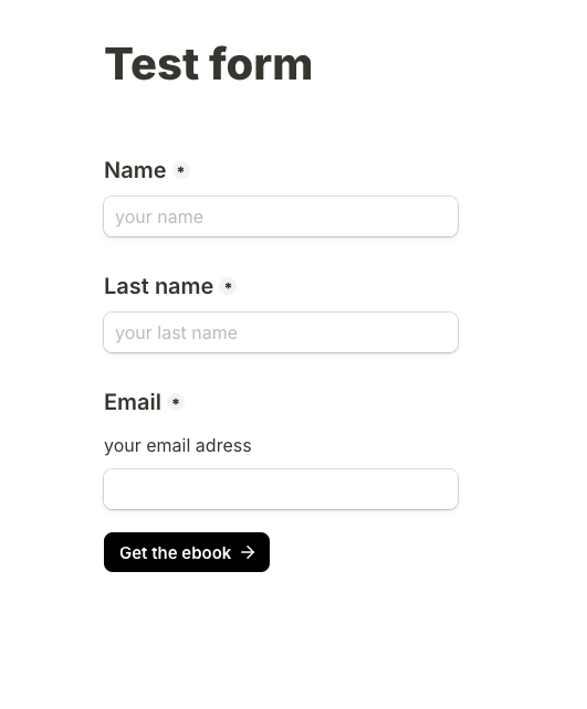
Use Tally to Capture Leads Everywhere
One of the simplest, most effective ways to capture leads across social platforms, blogs, and landing pages is Tally.
Its clean, lightweight design removes friction—no overwhelming fields, no clutter—just a smooth, fast experience that feels effortless for the user.
You can embed Tally almost anywhere—your blog, a landing page, your social bio, or inside a post—and instantly turn passive scrollers into warm leads with near-zero effort. It’s especially powerful for funnels where you want to segment users before recommending the right product, thanks to Tally’s conditional logic and instant redirects.
A/B Testing: The Real Secret to Growth
The biggest lifts usually come from testing:
- Headlines
- CTA text
- Hero images
- Form length
- Social proof placement
Test one thing at a time. Let the data tell the story—because assumptions are often wrong.
Using Heatmaps & Behavior Tools
Ive mentioned this before in this blog, but it’s such an important element. If you gained enough data, watching how visitors scroll, where they click, and where they hesitate reveals priceless insights. Heatmaps frequently expose sticking points you would never guess on your own.
A simple repositioning of a button or trimming a dense paragraph can rescue a struggling page.
I’d recommend checking out Hotjar for this.
Avoid These Common Conversion Killers
- Asking for too much information upfront
- Overloading with text
- Using generic stock photos
- Making users hunt for the CTA
- Redirecting people off the page with unnecessary links
Small mistakes create big drop-offs.
Accessibility That Helps Everyone
Accessible pages load faster, read cleaner, and feel more intuitive.
High contrast text, alt tags, and keyboard-friendly navigation improve usability for all visitors—not just those with accessibility needs.
Continuous Optimization: The Quiet Advantage
The best landing pages don’t “go live and stay live.”
They evolve.
New testimonials, improved visuals, shorter copy, or tweaks to your CTA can slowly push your conversion rate higher over time.
The pages that keep evolving win.
High-Converting Landing Pages — Power Summary
- Start with one clear promise that solves a specific problem; clarity always beats cleverness.
- Define the “one action” you want visitors to take—every element should push toward that single goal.
- Use a hero section that hits fast with a bold headline, a crisp sub-headline, and a primary CTA above the fold.
- Show empathy before expertise to reduce resistance and create rapport instantly.
- Highlight outcomes, not features so people visualize their transformation.
- Use social proof strategically—testimonials, logos, numbers—to build trust without clutter.
- Add skimmable content blocks to guide distracted readers toward your CTA.
- Use visual hierarchy (size, color, placement) to subtly direct attention where you want it.
- Remove anything that doesn’t sell—navigation bars, unnecessary links, or copy that adds cognitive load.
- Offer a “micro-yes” entry point such as a quiz, mini-survey, or low-commitment opt-in.
- Use Tally.so to collect leads anywhere with frictionless forms and smart segmentation.
- Create segment-based funnels so you recommend the right affiliate product to the right type of user.
- Run A/B tests continuously—swap headlines, CTAs, and layouts to discover what actually converts.
- Analyze scroll depth to see where people drop off and restructure the page accordingly.
- Use urgency ethically with limited-time bonuses, not fake deadlines.
- Add a value-loaded FAQ section to dissolve objections and boost conversions.
- Keep CTA text human and specific (e.g., “Show me my plan” instead of “Submit”).
- Optimize for mobile first, where most traffic lands and bounces fastest.
- Speed matters—compress images, use lightweight code, and simplify everything.
- Always track the numbers—CTR, conversion rate, and cost per lead—to iterate intelligently.


Pingback: How to create your own custom Spotify Wrapped 2025 for free -